Boroughwide

MTA Celebrates 50th Anniversary of Streamlined, Bolder Vignelli Subway Map
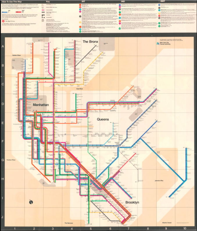
August 5, 2022 Raanan Geberer
Share this:

From brooklyneagle.com

Every once in a while, MTA New York City Transit, and its predecessor, the NYC Transit Authority, have changed its subway map around, trying to create a map that can make the city’s complicated subway system easier for straphangers to understand.

This year is the 50th anniversary of a colorful, diagrammatic map of the subway system, introduced by the Transit Authority and Unimark International, that’s commonly referred to as the Vignelli Map. The underground Transit Museum at Schermerhorn Street in Downtown Brooklyn is hosting an exhibit on the Vignelli Map, both inside the museum itself and online.

Subscribe to our newsletters

A 1958 subway map, known as the Salomon Map, just used three colors, one for each “family” of subway lines — the IND, BMT and IRT (the initials were a reminder of the pre-1940 era when the subways were operated by different companies). It used only straight lines and diagonals rather than representing the actual curves or the subway routes, a schematic that was continued in future maps (although not the current one).

The late designer Massimo Vignelli, then a principal of The late designer Bob Noorda, then a principal of Unimark International Designer Joan Charysyn, who provided valuable input into the 1972 Vignelli Map. Unimark International. Photos courtesy of New York Transit Museum

The next map, introduced in 1967 by a collaboration of designers, used a different color for each line. Where a particular stretch of subway track was shared by several lines, you would see several colors next to each other. The stops were represented by squares or rectangles containing the numbers or letters for all the lines using that stop.

The Vignelli Map was introduced in August 1972 by the TA and Unimark International, whose principals included Bob Noorda and Massimo Vignelli (other designers, like Joan Charysyn, were also involved). It was “the first map published by the Authority designed by an established design firm,” the Transit Museum said.

This new map made the printed lines representing the various subway maps wider and bolder, making them easier to see. Rather than having the stops represented by rectangles, they are simply represented by black dots inside the variously-colored lines, with the names of the stations to the side.

Perhaps most interestingly, as the Transit Museum said, the map “ignored geography” and depicted the shapes of the boroughs and the city’s rivers in a simplified way in order to emphasize the subway lines themselves. And in case some riders still didn’t get the point, they made the names of the boroughs stand out more, depicting them in red.

“Even though the Unimark-designed diagram was used for a relatively short time, it had a seismic impact on the way we think about transit routes and how they relate to the topography of a city,” said New York Transit Museum Curator Jodi Shapiro.

In 1979, a new subway map by a new group of designers was introduced, which showed not only the subways but the Staten Island Railway as well.

Still, in recent years, Vignelli’s map has been repurposed as an interactive diagram for the MTA’s on- line “Weekender” guide, which shows weekend service changes due to construction and maintenance work, according to the Transit Museum.

“Towards a Better Way: The Vignelli Map at 50” is on view on the platform

level of the New York Transit Museum in Down- town Brooklyn and online at nytransitmuseum.org/vi- gnelli. Located in a decommissioned subway station at 99 Schermerhorn Street, the New York Transit Museum is open Thursday through Sunday, 10 a.m. to 4 p.m. For more information on hours, admission and directions, visit nytransitmuseum.org/visit. The Transit Museum also operates a gallery and store at Grand Central Terminal.


Leave a Comment


Leave a Comment