Brooklyn Boro

Analysis: Why it’s so hard to spot NYC’s next coronavirus hot zones using public stats

While health officials make life-altering calls on neighborhood shutdowns, official data releases prevent New Yorkers from seeing what’s going on in real time.

October 21, 2020 Will Welch, THE CITY
Share this:

This story was originally published on Oct. 20 by THE CITY. Sign up here to get the latest stories from THE CITY delivered to you each morning.

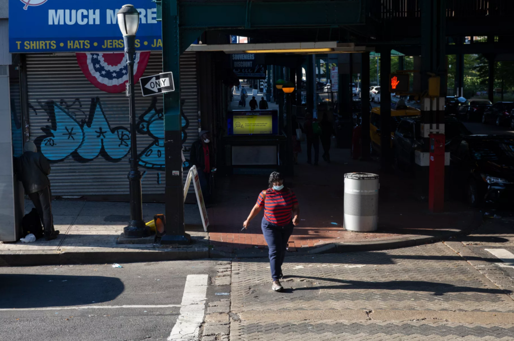
The end of daily briefings from Mayor Bill de Blasio highlighting ZIP codes with signs of COVID flare-ups has left New Yorkers unsure whether their neighborhood could be the next to see schools, businesses and other activities shut down.

It’s true that the city Department of Health and Mental Hygiene still makes available key information by ZIP code, via a map showing roughly how many residents are getting tested for COVID and, of those, what share test positive.
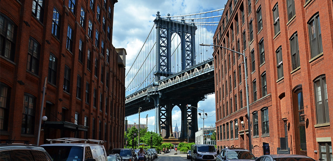
Subscribe to our newsletters

A version of that “positivity rate” helps guide government decisions around shutdowns and reopenings, making it a key number to watch.

But that map obscures recent trends. And the city’s published data does not align with the ZIP code-level positivity rates City Hall steadily released for about the two weeks that ended Oct. 6.

In other words: The way the city issues data prevents New Yorkers from seeing what’s going on in real time.

Since the early days of the pandemic, the Department of Health and Mental Hygiene has primarily published cumulative data showing the total number of cases, tests, hospitalizations and deaths reported since the first case of COVID-19 in New York City.

The department publishes daily updates to these numbers, moving the needle on the number of tests, cases and deaths upward and reflecting the most current information available on the spread of the virus across the city.

But those updates show when the health department received test results — not when new cases are detected. As a result, confusing glitches sometimes appear.

For instance, sometimes the cumulative number of tests actually drops from one day to the next, when the health department corrects previous reporting errors. The time it takes for labs to process tests also means that new cases are often retroactively reported days after a test takes place.

That’s why THE CITY’s Coronavirus in New York City tracker relies instead on figures provided by the New York State Department of Health, which delineates new cases and tests instead of using a cumulative number.

Big Data Differences

The city health department has slowly added accurate citywide and borough trend data over time, reporting counts by date instead of presenting a single current number. It began providing statistics on cases, hospitalizations and deaths by date in late March.

In May, it added cases and tests by the date of the test. But a majority of indicators — including ZIP code-level testing and positivity figures — are not broken out by date.

This thwarts attempts to pin down recent changes in the numbers — and spot clusters of outbreaks — since there is no way to reliably compare one day to another.

Bklyner highlighted the caveats with the cumulative data when it presented maps this week based on the updates of the total number of tests and total number of positive tests by ZIP code. It sliced off seven-day and 14-day samples to show the percent of tests in each area that yielded a positive result.

The result shows clear differences in positive-test rates between different neighborhoods, upwards of 8 percent in the hardest-hit areas of Brooklyn compared to less than 1 percent in the least.

But as Bklyner warned, “The numbers won’t add up neatly.”

Indeed, the mayor’s own positive-rate numbers during his news conferences highlighting hot spot ZIP codes diverged considerably from the positive-test rate that can be calculated for the same dates using the cumulative ZIP code numbers.

Raw Numbers Needed

This is not a new issue. Publications, including THE CITY, have been using changes in the cumulative data since the start of the pandemic to track new cases, switching to more accurate data as it became available.

But the errors caused by this method become much more pronounced at the ZIP code level, where small changes can create large swings in the positive rate.

Further complicating COVID data at the ZIP code level, its accuracy depends largely on a small number of test sites. Privacy concerns may emerge when an area’s numbers of infections and tests are small. And ZIP code data is missing or inaccurate for some tests.

Opening a narrow glimpse into neighborhood trends, starting in mid-August the city health department began to publish positivity rates and the number of people tested per 100,000 residents for each ZIP code — but only in four-week increments. The releases are further delayed for five days to allow late records to trickle in.

What DOHMH is not releasing, however, is the raw number of daily or weekly new infections and tests for each ZIP code. That’s the information needed to calculate the true positivity rate in real time — and provide reliable early warnings of flare-ups and shutdowns.

THE CITY is an independent, nonprofit news outlet dedicated to hard-hitting reporting that serves the people of New York.


Leave a Comment


Leave a Comment